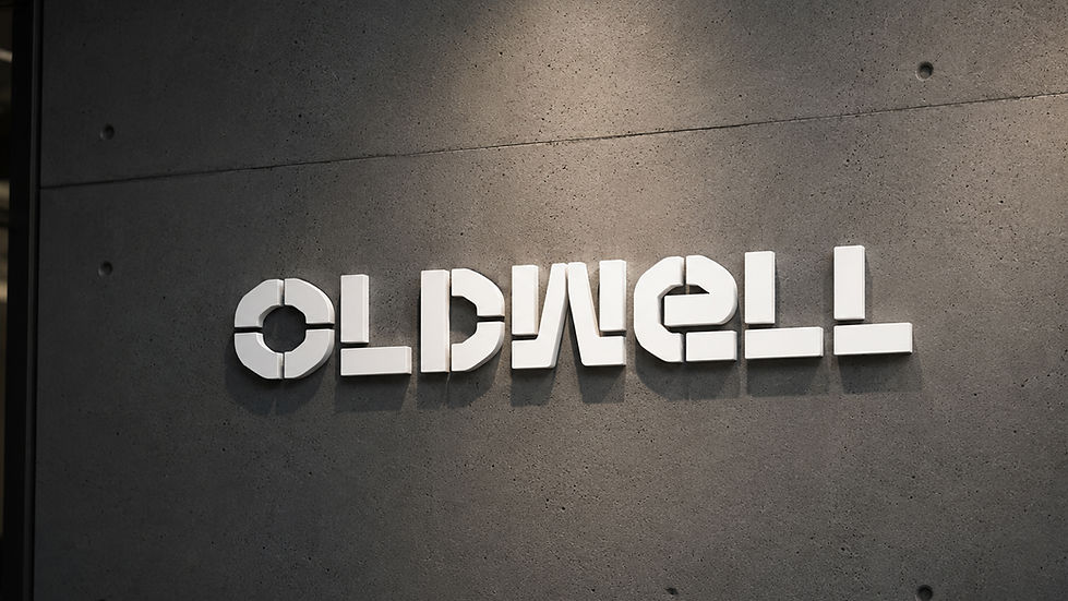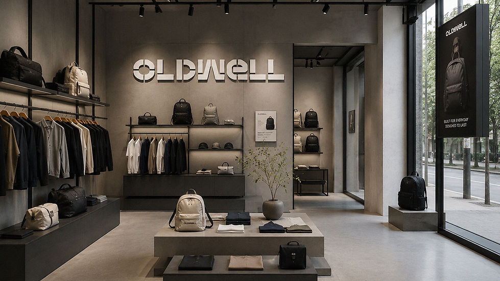
브랜드를 처음 접하는 사람은 제품을 사용하기 전에 먼저 브랜드를 바라봅니다. 그 첫인상을 결정하는 가장 중요한 요소가 바로 로고죠. 로고는 단순히 기업의 이름을 보기 좋게 표현한 글자나 형태가 아니라 브랜드의 철학과 가치, 역사, 방향성을 가장 압축적으로 담아내는 상징성입니다. 소비자는 로고를 통해 브랜드를 기억하고, 신뢰를 형성하며, 시간이 지날수록 그 로고에 축적된 경험을 하나의 이미지로 받아들이게 됩니다. 세계적인 브랜드일수록 로고 개발에 오랜 시간과 많은 연구를 투자하는 이유도 여기에 있죠. 좋은 로고는 유행을 따르기보다 브랜드가 오랫동안 사용할 수 있는 기준을 만들고, 다양한 제품과 공간, 매체에서 일관된 정체성을 유지하는 중심축이 됩니다. 올드웰의 로고 개발 역시 이러한 관점에서 시작되었습니다. 단순히 멋있는 워드마크를 만드는 것이 아니라, 브랜드가 앞으로 수십 년 동안 유지할 수 있는 상징을 만드는 것을 목표로 했죠. 올드웰이라는 이름은 오래된 것에서 느껴지는 깊이와 가치 그리고 우물이 상징하는 생명력과 풍요 공동체의 의미를 동시에 담고 있습니다. 오래된 것은 단순히 낡은 것이 아니라 시간이 지나면서 더욱 가치가 깊어진 것을 의미하며 우물은 오랜 세월 동안 사람들의 삶을 이어주는 중심 공간이었습니다. 이러한 두 가지 의미를 시각적으로 연결하는 것이 이번 프로젝트의 과제였죠. 디자인 과정에서는 먼저 우물이라는 구조를 분석했습니다. 전통적인 우물은 대부분 둥근 원기둥 형태이며 수많은 벽돌을 일정한 규칙으로 하나씩 쌓아 올려 견고한 구조를 완성합니다. 하나의 벽돌만으로는 우물이 될 수 없지만 반복과 균형을 통해 강한 구조가 만들어지죠. 브랜드가 성장하는 과정과도 비슷합니다. 좋은 제품 서비스 경험이 쌓여 결국 신뢰받는 브랜드를 만들어 가듯이 우물 역시 작은 벽돌들의 축적을 통해 오랜 시간 유지되는 구조물이 됩니다. 올드웰은 바로 이러한 상징성에서 출발점을 찾았습니다.
This project involved the development of the logo design for “JAWOON,” a Korean traditional hanok-style hotel and Airbnb accommodation brand planned for Gongju, Chungcheongnam-do, South Korea. The client sought a brand identity that could seamlessly capture the historical significance of Gongju and Sejong City, their beautiful natural landscapes, and the essence of Korean culture and aesthetics. Rather than simply creating an attractive logo, the goal was to establish a visual identity that could embody the atmosphere of the future architectural space while reflecting the unique cultural character of the region.
Logo design is the process of visually expressing a brand’s philosophy and identity. Therefore, the project began by defining the brand concept around key themes such as Korean aesthetics, hanok architecture, traditional culture, nature, history, and contemporary design sensibilities. A major objective was to create a symbol that would feel familiar and meaningful to Korean audiences while remaining visually accessible and appealing to international visitors.
During the concept development phase, inspiration was drawn from Munjado, a traditional Korean folk art style that incorporates symbolic imagery into written characters. This artistic tradition was particularly suitable for conveying the story and values of the brand. Special attention was given to the first consonant of “JAWOON,” the Korean letter “ㅈ,” which bears a visual resemblance to the English letter “J.” This observation led to the creation of a symbolic logo that could be interpreted as the Korean consonant “ㅈ” by Korean viewers and as the letter “J” by international audiences.
The initial sketches focused on simple brushstroke-inspired forms. As the design evolved, the flow of the strokes and curves was refined to emphasize Korean artistic sensibilities while incorporating visual characteristics inspired by Munjado and traditional East Asian paintings. Within the symbol itself, various elements commonly found in Korean paintings—including cranes, clouds, rocks, flowers, mushrooms, and waterfalls—were integrated to represent nature, harmony, longevity, prosperity, and cultural heritage.
Following the concept sketching phase, the design was refined through vector development and line optimization, resulting in a complete identity system consisting of the symbol logo, Korean wordmark, and English wordmark. The Korean wordmark was not based on a standard typeface; instead, it was custom-designed with symbolic and artistic characteristics to further strengthen the uniqueness of the brand identity.
The final logo successfully combines the beauty of Korean traditional culture with a modern visual sensibility, creating a distinctive and memorable identity for JAWOON. It was designed to serve not only as a logo but also as a visual representation of the brand’s philosophy, architectural vision, and cultural storytelling.
One challenge throughout the process was ensuring that the logo’s identity would remain recognizable in monochrome applications, as the Munjado-inspired design contains intricate internal details and symbolic elements. Nevertheless, this project became a meaningful exploration of how traditional Korean culture, regional heritage, and brand philosophy can be unified within a single visual symbol. It is hoped that, together with the completion of the future hanok hotel, JAWOON will continue to grow into a valuable and distinguished hospitality brand that celebrates the beauty and spirit of Korea.
"Any unauthorized reproduction, distribution and exhibition of this work will be subject to applicable law. © 2026 NODE
@park_keun