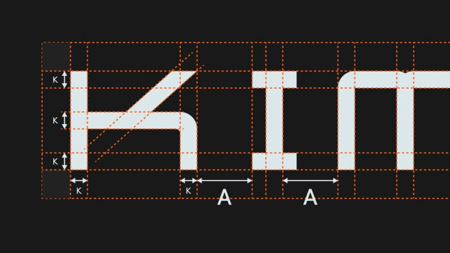
오늘 소개해 드릴 로고 디자인은 미쉐린 셰프가 운영하는 프랜차이즈 브랜드의 리뉴얼 프로젝트입니다. 기존에는 브랜드 이니셜인 알파벳 ‘K’를 활용한 심볼 로고를 개발했지만, 이미 유사한 형태의 디자인이 많아 저작권 등록에 어려움이 있었습니다. 결국 클라이언트는 단순한 알파벳 형태가 아닌, 브랜드만의 상징성을 가진 새로운 심볼 로고를 요청하게 되었습니다.
처음에는 기존 K 로고를 추상적으로 디벨롭해 확장성을 유지하려 했습니다. 특히 계열사가 많은 브랜드는 특정 이미지를 강하게 드러내기보다 다양한 브랜드를 포용할 수 있는 유연한 디자인이 중요하다고 생각했기 때문입니다. 하지만 이번에는 클라이언트가 ‘용’과 ‘드래곤’을 모티브로 한 로고를 원했고, 여기서부터 많은 고민이 시작되었습니다.
레스토랑과 용이라는 키워드는 쉽게 중국집 로고를 연상시키기 때문에, 기존의 익숙한 이미지를 벗어나는 것이 가장 큰 과제였습니다. 그래서 동양의 용보다는 유럽 왕가와 귀족 문장에 등장하는 서양의 드래곤 심볼을 참고해 디자인 방향을 잡았습니다. 동시에 한국에서 용이 가지는 의미도 중요하게 생각했습니다. 한국의 용은 괴물이나 정복의 대상이 아니라 자연과 질서를 다스리는 상징적 존재로 여겨지기 때문입니다.
초기에는 여의주를 문 동양의 용도 스케치했지만, 너무 한정적인 인상을 줄 수 있다는 판단이 들었습니다. 결국 동양의 상징성과 서양 드래곤의 강인한 이미지를 조화롭게 담아내는 방향으로 디자인을 완성했습니다. 디자인은 결국 끊임없이 질문하고 의심하는 과정인 것 같습니다. 소비자에게 어떻게 보일지, 브랜드의 정체성을 제대로 담고 있는지 수없이 고민하며 가장 적합한 형태를 찾아가는 과정이 바로 로고 디자인의 본질이라고 생각합니다.
Today, I’d like to introduce a logo redesign project for a franchise brand operated by a Michelin chef. The original logo used the letter “K” as the main symbol, but because there were already many similar alphabet-based logo designs on the market, the client faced difficulties with copyright registration. As a result, they requested a completely new symbol design that could represent the brand with a more unique identity.
At first, I wanted to maintain the existing “K” concept by developing it into a more abstract and flexible form. For brands with multiple affiliates, I believe it is important to create a design that feels open and adaptable rather than one with an overly fixed image. However, this time the client specifically requested a logo inspired by a “dragon.” That was where the real challenge began.
When people think of dragons and restaurants, many immediately associate the image with Chinese restaurant branding. To avoid that familiar impression, I focused less on traditional Eastern dragons and instead referenced Western dragons commonly found in royal crests and noble family emblems. At the same time, I also considered the cultural meaning of dragons in Korea. In Korean culture, dragons are not seen as monsters or creatures to be conquered, but as symbolic beings that govern nature, order, and harmony.
In the early stages, I explored sketches of traditional Eastern dragons holding a magical pearl, but I felt the imagery became too culturally limited for a modern restaurant brand. Eventually, I developed a direction that balanced the elegance and symbolism of Eastern dragons with the strength and authority of Western dragon imagery.
Design is ultimately a constant process of questioning and refining. You continuously ask yourself how consumers will perceive the brand and whether the design truly represents its identity. Through that process of doubt, exploration, and refinement, the final logo begins to take shape.
"Any unauthorized reproduction, distribution and exhibition of this work will be subject to applicable law. © 2025 NODE
@park_keun