SOD LAB의 로고는 브랜드가 지향하는 철학과 연구 방향성을 시각적으로 응축한 디자인입니다. 이 로고는 ‘SOD’라는 이름의 과학적 이미지를 기반으로, 바이오·더마·스킨사이언스의 연결성과 균형을 상징하는 구조로 디자인되었습니다. 유기적으로 이어지는 곡선은 세포와 분자 구조, DNA의 흐름, 피부 순환 시스템을 연상시키며, 단순한 화장품 브랜드가 아닌 연구 중심의 스킨 솔루션 기업이라는 인상을 전달합니다. 특히 끊기지 않고 이어지는 하나의 라인은 피부와 과학, 자연과 기술, 효능과 감성의 연결을 의미하며, 브랜드가 추구하는 지속 가능한 아름다움과 정교한 피부 과학을 상징합니다.
심볼 내부의 원형 노드는 활성 성분과 피부 세포의 상호작용을 시각화한 요소로, 바이오 연구소의 데이터 포인트처럼 보이면서도 동시에 부드럽고 친근한 인상을 유지합니다. 이는 전문적인 연구 기반 브랜드이면서도 소비자에게 어렵지 않고 감각적으로 다가가고자 하는 SOD LAB의 방향성을 담고 있습니다. 전체 로고는 지나치게 장식적이지 않은 미니멀 구조로 설계되었으며, 정밀한 그리드 시스템과 비례 계산을 기반으로 제작되어 높은 완성도와 신뢰감을 제공합니다. 이러한 기하학적 균형감은 브랜드의 안정성, 기술력, 정제된 품질 관리 시스템을 상징합니다.
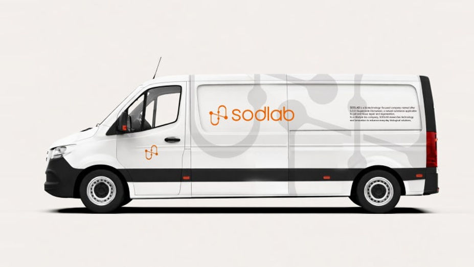
The SOD LAB logo is a visual embodiment of the brand’s philosophy and research direction. Built upon the scientific identity implied by the name “SOD,” the logo symbolizes the connectivity and balance of bio science, derma technology, and skin science through its structured yet organic form. The continuously flowing curves evoke the imagery of cells, molecular structures, DNA strands, and the circulation systems within the skin, creating the impression of a research-driven skin solution company rather than a conventional cosmetics brand. In particular, the unbroken line represents the seamless connection between skin and science, nature and technology, efficacy and sensibility, reflecting the brand’s pursuit of sustainable beauty and sophisticated skin science.
The circular nodes within the symbol visualize the interaction between active ingredients and skin cells. While they resemble scientific data points found in biotechnology laboratories, they also maintain a soft and approachable aesthetic. This balance expresses SOD LAB’s vision of being a highly professional research-based brand that remains emotionally accessible and visually refined for consumers. The overall logo is designed with a minimal structure free from unnecessary decoration, and it is carefully constructed using a precise grid system and proportional calculations to achieve a high level of refinement and trustworthiness. This geometric balance symbolizes the brand’s stability, technological expertise, and rigorous quality management system.
"Any unauthorized reproduction, distribution and exhibition of this work will be subject to applicable law. © 2026 NODE
@park_keun