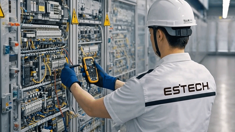
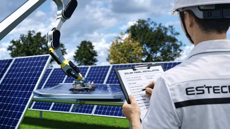
에너지 기술 기업으로서의 정체성을 명확하게 전달하기 위해 기존 브랜드 이미지를 현대적이고 기술 중심적인 아이덴티티로 재정립한 리브랜딩 C.I 디자인 프로젝트입니다. 기존의 에스텍 로고가 타원형 심볼과 단순한 알파벳 e 중심의 전통적인 기업 이미지를 가지고 있었다면 새롭게 개발된 ESTECH 브랜드 아이덴티티는 기술기업으로서의 전문성과 미래지향적인 이미지를 강화하는 방향으로 설계되었습니다. 새로운 심볼은 원형 구조를 기반으로 하여 에너지의 순환과 흐름 그리고 시스템 통합을 상징하며 중앙을 가로지르는 수평 라인은 에너지의 흐름과 제어 그리고 기술을 통해 균형을 이루는 에너지 플랫폼의 개념을 시각화 했습니다. 기존 심벌 디자인의 헤리티지를 이어가는 알파벳 e 형태를 유지하며 동시에 전력, 데이터, 기술이 하나의 네트워크로 연결되는 구조를 시각적으로 상징하고 산업 기술 기업의 정밀함과 안정성을 전달합니다. 알파벳 소문자 e에 블랙홀과 태양의 정체성을 더해 새로운 기업의 상징성을 만들었습니다.
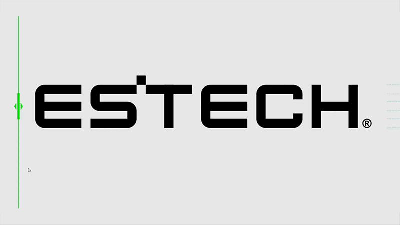
워드마크 디자인은 직선적이고 균형 잡힌 산세리프 타이포그래피를 기반으로 설계되어 높은 가독성과 기술적 이미지를 동시에 구현했습니다. 불필요한 장식을 배제한 구조적인 글자 형태는 기술 기업이 가지는 정확성, 신뢰성, 그리고 기능 중심의 철학을 반영하며 ESTECH이라는 이름 자체가 에너지(Energy)와 기술(Technology)의 결합을 의미하는 기업의 철학을 시각적으로 명확하게 전달합니다. 한글 로고인 ‘에스텍(주)’ 역시 동일한 미니멀한 타이포그래피 스타일을 적용하여 영문과 한글이 동일한 브랜드 톤을 유지하도록 설계되었으며 다양한 매체와 환경에서 일관된 기업 심벌과 워드마크를 적용할 수 있도록 구성되었습니다. 브랜드 확장 구조 또한 중요한 디자인 요소로 설계되었는데 ESTECH을 중심으로 ESS, EMS, ICT, CEMS, VPP와 같은 기술 사업 영역이 체계적으로 연결되는 구조를 시각화했습니다. 각 사업 영역은 동일한 심볼을 공유하면서도 컬러를 통해 구분되어 하나의 통합 플랫폼 기업이 다양한 기술 솔루션을 제공하는 구조를 표현했습니다.
컬러 시스템 역시 브랜드 정체성을 강화하는 중요한 요소로 개발되었습니다. 메인 컬러인 ESTECH Blue는 기술 기업의 신뢰성과 전문성을 상징하며 에너지 기술 기반 기업으로서의 핵심 이미지를 전달합니다. Sky Blue 컬러는 에너지와 기술이 결합된 미래지향적인 이미지를 표현하며 디지털 환경과 스마트 에너지 플랫폼의 확장성을 이어갑니다. Black과 Gray 컬러는 산업 기술 기업이 가지는 안정성과 정밀함을 강조하며 다양한 산업 환경과 매체에서 브랜드의 일관성을 유지하도록 보조 색상으로 사용합니다. 이러한 컬러 체계는 산업 기술 브랜드에서 중요한 명확성과 가독성을 유지하면서도 현대적인 기업 이미지를 구축하도록 설계되었습니다.
To clearly communicate the identity of an energy technology company, this project is a rebranding C.I design initiative that redefines the existing brand image into a more modern and technology-oriented identity. While the previous ESTECH logo was based on an oval symbol and a traditional corporate image centered on the lowercase alphabet “e,” the newly developed ESTECH brand identity was designed to strengthen the company’s professional and future-oriented image as a technology enterprise. The new symbol is built on a circular structure that represents the circulation and flow of energy as well as system integration, while the horizontal line passing through the center visualizes the concept of an energy platform where energy flow, control, and technology are balanced. The design maintains the heritage of the original symbol by preserving the form of the lowercase letter “e,” while simultaneously symbolizing a network structure in which electricity, data, and technology are interconnected. This visual language conveys the precision and stability of an industrial technology company. By combining the lowercase “e” with the symbolic identity of a black hole and the sun, the design creates a new corporate symbol that represents both energy and technological power.
The wordmark design is based on a straight, balanced sans-serif typography that achieves both high readability and a technological image. The structured letterforms, free from unnecessary decoration, reflect the values of accuracy, reliability, and a function-oriented philosophy that define technology companies. The name “ESTECH” itself visually conveys the company’s philosophy, representing the integration of Energy and Technology. The Korean logotype “에스텍(주)” applies the same minimal typographic style so that both the English and Korean versions maintain a consistent brand tone. This allows the corporate symbol and wordmark to be applied consistently across various media and environments. The brand architecture was also designed as an important element of the identity system, visualizing a structured network of technological business sectors centered around ESTECH, including ESS, EMS, ICT, CEMS, and VPP. Each business sector shares the same core symbol while being differentiated through color, expressing the structure of an integrated platform company that provides diverse technological solutions within a unified energy ecosystem.
The color system was also developed as a key element to reinforce the brand identity. The primary color, ESTECH Blue, symbolizes reliability and professionalism as a technology company and represents the core image of an energy-technology-based enterprise. The Sky Blue color expresses a future-oriented image where energy and technology converge, extending into digital environments and smart energy platforms. Black and Gray emphasize the stability and precision associated with industrial technology companies and are used as supporting colors to maintain brand consistency across various industrial environments and media applications. This color system was designed to maintain the clarity and readability essential to industrial technology brands while establishing a contemporary and sophisticated corporate image.
"Any unauthorized reproduction, distribution and exhibition of this work will be subject to applicable law. © 2026 NODE
@park_keun