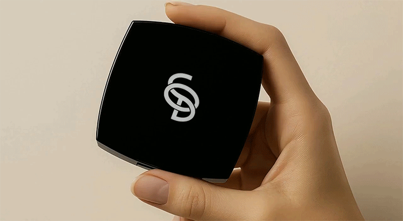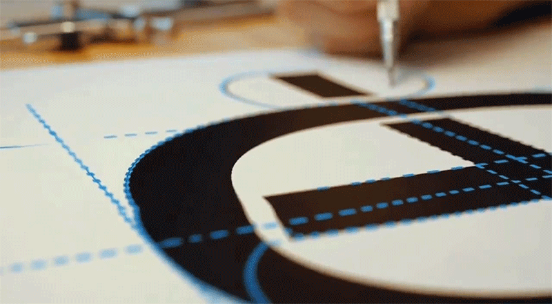

이 로고는 알파벳 S, O, D의 결합을 기반으로 제작된 심볼로, 화장품 브랜드의 모던하고 프리미엄한 정체성을 시각적으로 표현하고 있습니다. 전체적인 형태는 모비우스의 띠(Möbius strip) 구조를 차용하여, 무한한 가능성과 순환, 혁신의 지속성을 상징하며 디자인은 단순한 알파벳의 조합을 넘어, 유기적으로 연결된 곡선의 흐름을 통해 브랜드의 유연함과 기술적 완성도를 전달합니다.
특히 S의 상단 곡선과 D의 하단 스트로크가 중심부에서 O 형태로 교차하며 입체적인 공간감과 함께 균형 잡힌 조형미를 형성하며이러한 구조는 화장품 산업에서 요구되는 정밀함, 세련됨, 그리고 끊임없는 연구정신을 시각적으로 표현되었습니다.
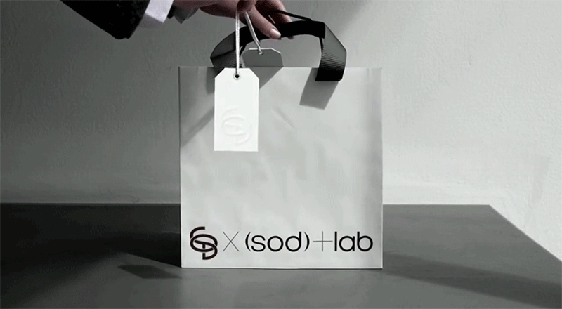
색상은 모노톤 블랙 & 화이트를 사용해 고급스러움과 컨템포러리를 유지하면서 어떤 매체에서도 명확하게 인식될 수 있는 심플함을 확보했습니다. 결과적으로 이 로고는 “과학적 아름다움과 감성의 조화”라는 브랜드 철학을 함축하며, 패키지, 사인, 명함, 제품 표면 등 다양한 응용환경에서 프리미엄 아이덴티티를 일관되게 표현하도록 설계되었습니다.
This logo is a symbol created by combining the letters S, O, and D, visually expressing the modern and premium identity of a cosmetics brand. Its overall form adopts the structure of a Möbius strip, symbolizing infinite possibilities, circulation, and continuous innovation. Beyond a simple combination of letters, the organically connected flow of curves conveys the brand’s flexibility and technical sophistication.
In particular, the upper curve of the “S” and the lower stroke of the “D” intersect at the center to form the “O,” creating a three-dimensional sense of space and balanced aesthetic composition. This structure visually reflects the precision, refinement, and constant research spirit required in the cosmetics industry.
A monochromatic black & white palette maintains luxury and contemporary elegance while securing simplicity and clear visibility across all media. Ultimately, this logo embodies the brand philosophy of “harmonizing scientific beauty and emotional sensibility,” and is designed to express a consistent premium identity across various applications, including packaging, signage, business cards, and product surfaces.