보다(BODA)’는 지능형 무인 호텔 운영 시스템을 구축하는 브랜드로, 기존 호텔 산업의 경직된 운영 체계에서 벗어나 자동화된 효율성과 사용자 중심의 기술을 통해 새로운 공간 경험을 제공하고자 합니다. 브랜드명 ‘보다’는 한국어 동사에서 유래되어 ‘경험하다’, ‘미래를 내다보다’, ‘탐색하다’ 등 다양한 확장 의미를 지니며, 이는 브랜드가 지향하는 방향성과 정체성에 직결됩니다. 본 디자인 제안은 이러한 철학을 시각적으로 표현하고, 일관된 브랜드 아이덴티티를 구축하는 데 목적이 있습니다.
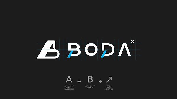
심벌 디자인은 알파벳 B를 중심으로 하여 화살표 형태를 결합시킴으로써 ‘방향성’, ‘전망’, ‘진보’를 상징합니다. 이는 사용자가 직관적으로 경험할 수 있는 스마트한 인터페이스, 그리고 브랜드가 끊임없이 진화하고 있음을 나타냅니다. 로고타입은 B, O, D, A의 반복적 구조에서 리듬과 규칙성을 부여하여 디지털 시스템처럼 체계적이고 신뢰감 있는 인상을 주며, 각 알파벳은 균형감 있는 구조로 설계되어 브랜드의 안정성과 기술력을 강조합니다. 특히 A의 사선은 상승과 개방, 미래지향성을 상징합니다.
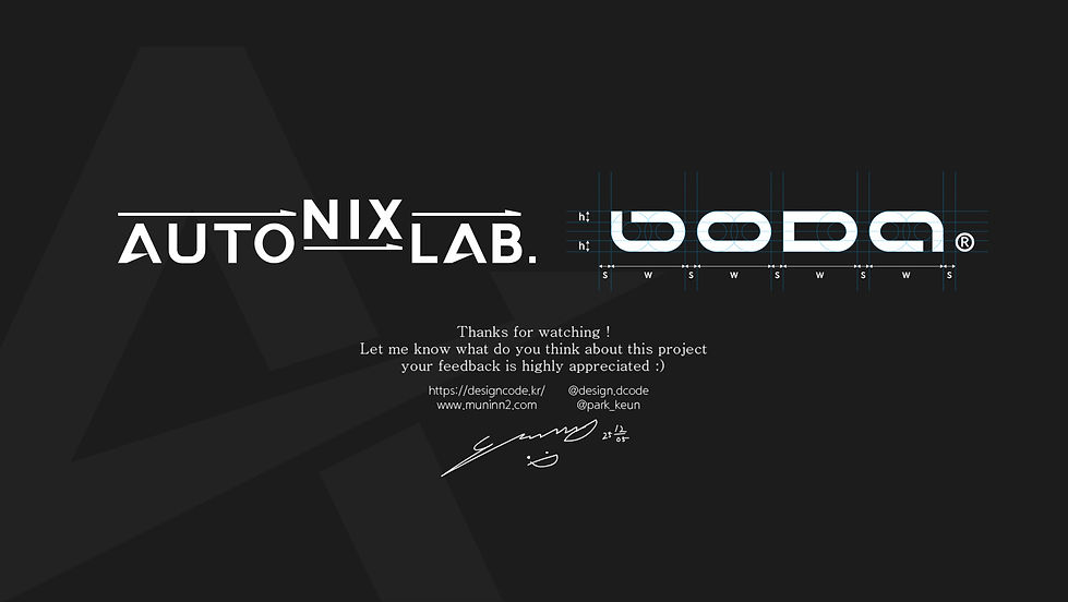
컬러는 메인 블루 톤을 중심으로 퍼플 계열을 보조적으로 사용하여 기술 기반 신뢰감과 창의적 이미지를 동시에 부여하며, 전체적으로는 절제되고 고급스러운 무드를 유지합니다. 로고는 다양한 환경에서 유연하게 적용될 수 있도록 심벌 단독형, 조합형, 최소형 등으로 확장 개발되었으며, 모바일 앱, 키오스크, 객실 키, 간판, 유니폼 등 실제 운영 환경에서 활용 가능성을 고려하였습니다.
디자인 컨셉은 ‘스마트 공간’, ‘미래를 바라보는 시선’, ‘기술과 사용자 경험의 연결’이라는 세 가지 키워드로 요약됩니다. 이를 통해 BODA는 단순한 무인 호텔 브랜드가 아닌, 공간과 기술이 결합된 지능형 플랫폼으로 자리매김할 수 있는 시각적 정체성을 갖추게 됩니다. 본 제안은 향후 브랜드 확장과 응용에도 강력한 기반이 될 것입니다.
BODA is a brand dedicated to the development of an intelligent unmanned hotel operation system, aiming to redefine the hospitality experience through automation, efficiency, and user-centered technology. The name “BODA,” derived from the Korean verb meaning “to see,” carries layered meanings such as “to experience,” “to foresee,” and “to explore.” These connotations reflect the brand’s commitment to delivering advanced, exploratory, and future-oriented hospitality solutions. This design proposal seeks to visually express the brand’s philosophy and establish a consistent and compelling brand identity.
The symbol design is based on the letter “B,” merged with an arrow motif to represent direction, outlook, and progress. This symbolizes both the intuitive, smart interface that users interact with and the brand’s continuous evolution. The logotype emphasizes rhythm and structure through the repetition and alignment of the letters B, O, D, and A. Each character is carefully designed to convey a sense of systemized order and reliability, reflecting the brand’s technological foundation. The angled stroke in “A” further implies upward movement, openness, and a vision for the future.
The primary color palette utilizes a modern blue tone complemented by subtle purples, creating a balance between technological trust and creative sophistication. The visual identity is designed to be versatile, offering various logo applications—from symbol-only versions to full combinations—that ensure usability across digital platforms, kiosks, room keys, signage, uniforms, and other brand touchpoints.
The design concept revolves around three core themes: “smart spaces,” “a forward-looking vision,” and “the intersection of technology and user experience.” With these themes, BODA positions itself not merely as a hotel brand but as an intelligent platform where space and technology harmonize. This proposal lays a strong foundation for scalable and consistent brand expansion in future applications.