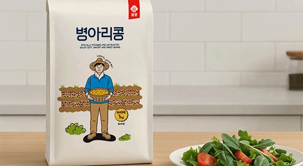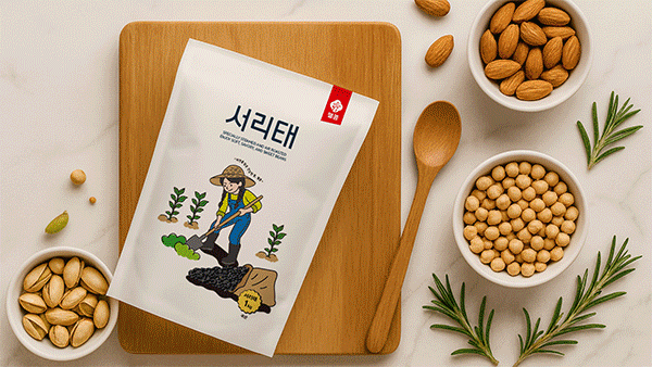
한국의 식품 세트 디자인 시리즈는 ‘웰콩(WELL KONG)’이라는 브랜드의 곡물 패키지로, 전반적으로 농부의 정직함과 자연 친화적인 브랜드 철학을 시각적으로 표현한 정돈된 패키지 디자인입니다. 병아리콩과 서리태 두 가지 품목이 각각의 캐릭터로 구분되어 있으나, 통일된 구조와 레이아웃, 일러스트 스타일을 유지함으로써 브랜드 일관성을 확보했고 전체적인 패키지는 매트한 미색 바탕에 농부 캐릭터 일러스트를 중심으로 배치하여 따뜻하고 신뢰감 있는 이미지를 전달하며 동시에 심플하고 현대적인 느낌을 잃지 않도록 여백을 충분히 확보했습니다. 전면 중앙에는 제품명을 ‘병아리콩’과 ‘서리태’로 큼직하게 배치하였으며 산세고딕 계열의 두꺼운 서체를 사용해 안정감과 식품 브랜드의 정직함을 강조했습니다.
영문 슬로건 “SPECIALLY STEAMED AND AIR ROASTED, ENJOY SOFT, SAVORY, AND SWEET BEANS”은 브랜드의 기술력과 품질에 대한 자신감을 나타내며 한글 명칭 아래에 균형감 있게 위치시켜 국제 시장에서도 통용될 수 있는 구조를 갖췄습니다. 상단 우측에는 붉은색 라벨 형태의 웰콩 로고가 배치되어 브랜드의 아이덴티티를 확실히 각인시키는데 이 붉은 포인트는 전체적으로 차분한 톤의 패키지 속에서 시각적 초점을 형성하며 브랜드 인지도를 높이는 역할을 한다.
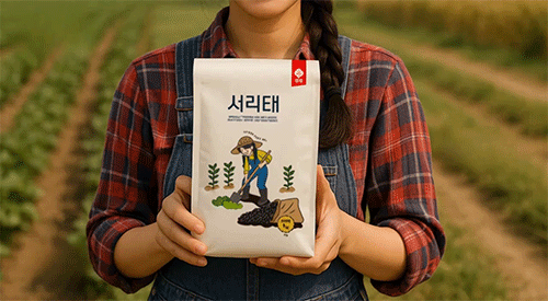
패키지의 핵심 시각 요소인 일러스트는 병아리콩에는 남성 농부, 서리태에는 여성 농부를 등장시켜 자연스럽게 제품의 성격을 구분하고 친근한 이미지를 부여했습니다. 각각의 인물은 전통적인 농부 복장과 밀짚모자를 착용하고 있으며 손에는 수확한 콩을 담은 바구니나 삽을 들고 있어 정직한 재배, 직접 수확의 메시지를 전합니다. 특히 병아리콩 패키지에서는 농부가 노란 병아리콩을 두 손으로 들고 미소 짓는 장면을 중심으로 뒤편의 밭과 콩 줄기들이 단순화된 색면으로 표현되어 있으며, 서리태 패키지에서는 여성 농부가 땅을 일구는 장면을 묘사해 노력과 정성을 상징적으로 드러냈습니다. 이러한 일러스트는 평면적이지만 따뜻한 색감과 유머러스한 표현 덕분에 전통과 현대가 조화된 감성을 전하며 소비자에게 제품의 진정성과 수공적인 느낌을 효과적으로 전달합니다.
The Korean food package design series for the brand “WELL KONG” visually expresses the honesty of farmers and the brand’s nature-friendly philosophy through clean and well-organized packaging. Although the two products Chickpeas and Seoritae (black beans) are differentiated by their own illustrated characters, they maintain consistency in layout, composition, and illustration style, thereby ensuring strong brand coherence. The overall packaging features a matte ivory background centered around a farmer illustration, conveying warmth and trust while preserving a simple and modern aesthetic through generous use of white space.
At the center of the front design, the product names “병아리콩 (Chickpeas)” and “서리태 (Seoritae)” are displayed in large, bold Sans-serif typography, emphasizing the stability and integrity typical of a quality food brand. The English slogan “SPECIALLY STEAMED AND AIR ROASTED, ENJOY SOFT, SAVORY, AND SWEET BEANS” reflects the brand’s confidence in its technology and product quality, placed harmoniously beneath the Korean title to create a structure suitable for both domestic and global markets. A red label tag featuring the WELL KONG logo is positioned at the upper right corner, reinforcing the brand’s identity. This red accent provides a visual focal point within the calm overall tone, enhancing brand recognition.
The key visual element the illustration portrays a male farmer for the chickpeas and a female farmer for the black beans, naturally distinguishing the products while lending a friendly, approachable image. Both characters wear traditional farming attire with straw hats, and they hold either a basket of freshly harvested beans or a shovel, symbolizing sincerity and hands-on cultivation. On the chickpea package, the male farmer is shown smiling as he holds a basket filled with golden chickpeas, while simplified graphic depictions of farmland and bean rows in the background add depth. On the seoritae package, the female farmer is depicted cultivating the soil, embodying themes of dedication and care.
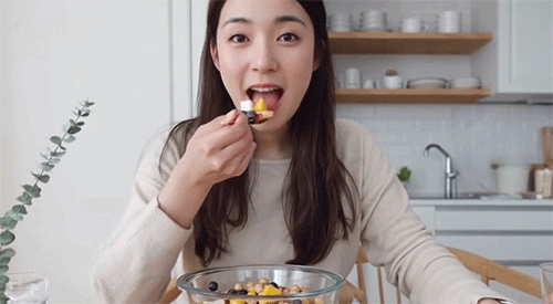
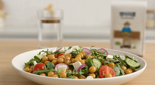
These illustrations, though flat in style, use warm colors and humorous, human touches to harmonize traditional and modern sensibilities. They successfully communicate authenticity, craftsmanship, and warmth, allowing consumers to sense the brand’s sincerity. Overall, the WELL KONG packaging series combines emotional storytelling with clear structure, capturing the essence of trust, nature, and the honest labor of farmers in a refined, modern visual language.
"Any unauthorized reproduction, distribution and exhibition of this work will be subject to applicable law. © 2025 NODE 저작권
By @park_keun