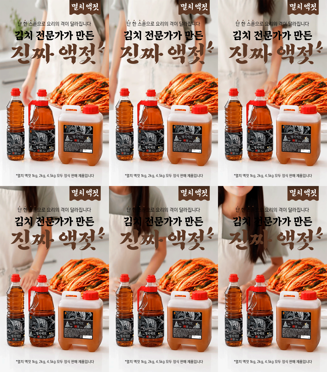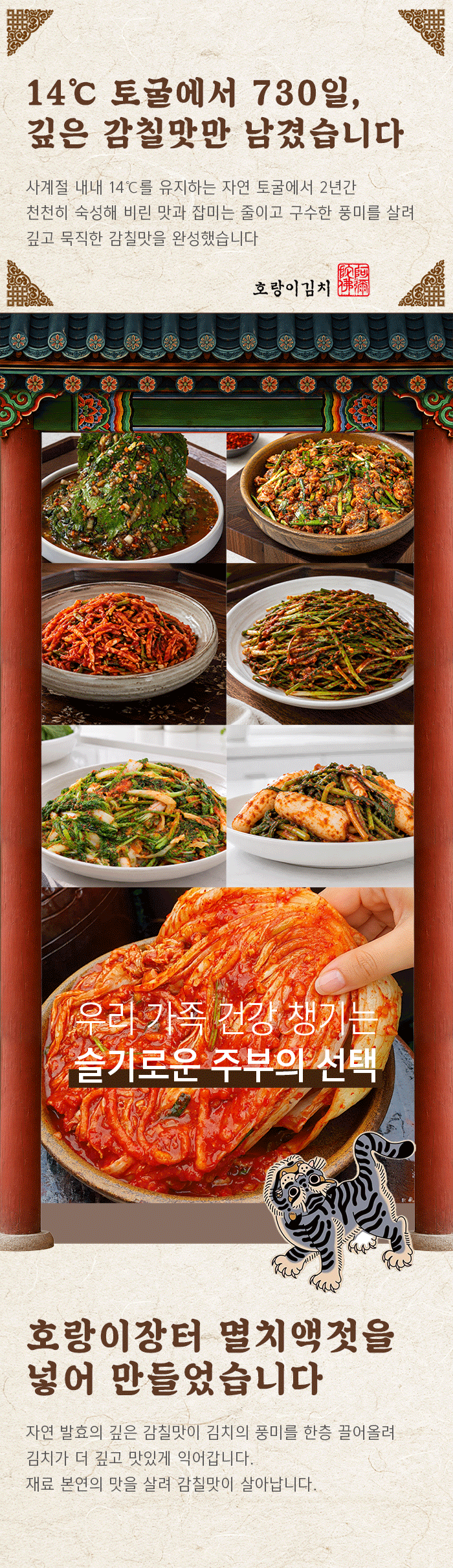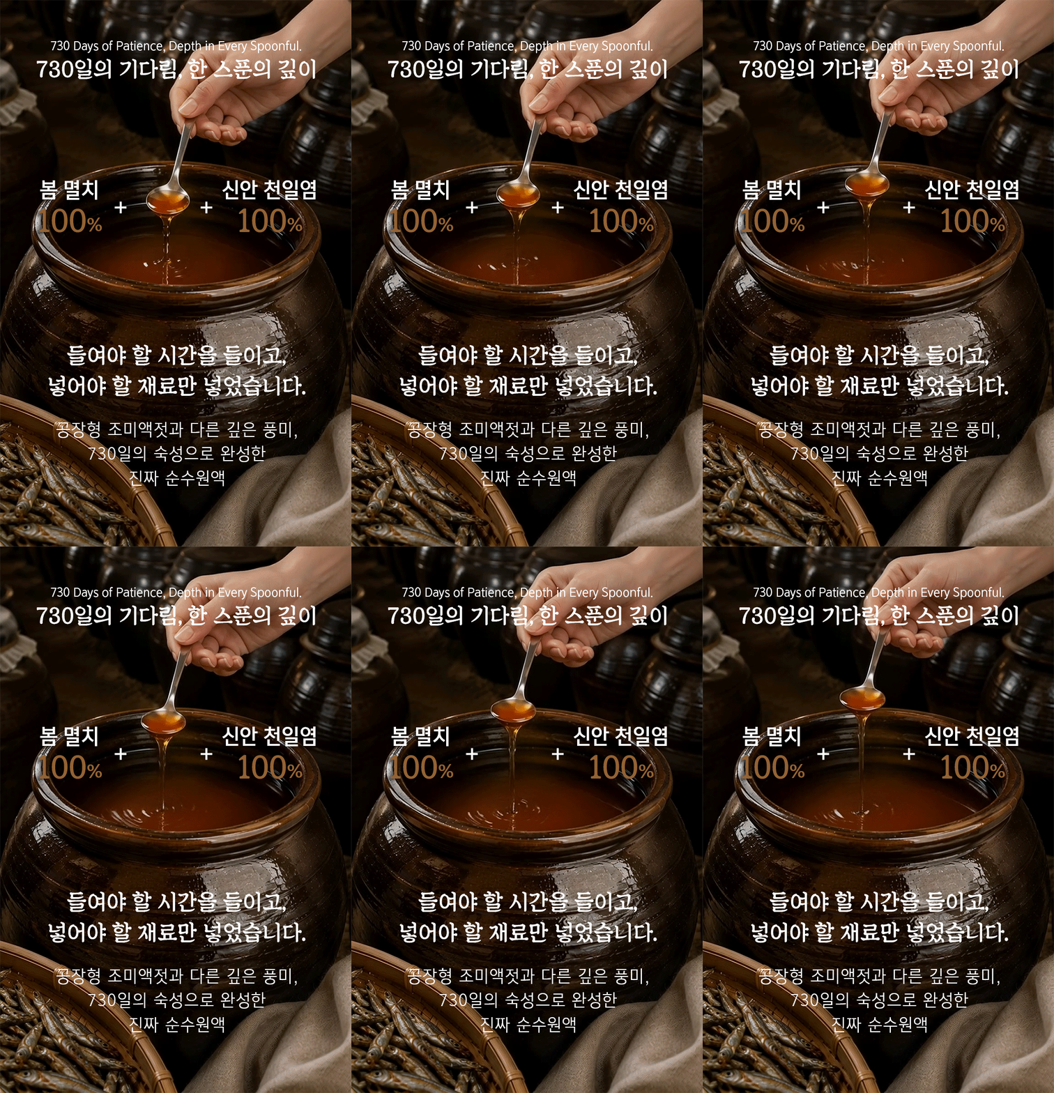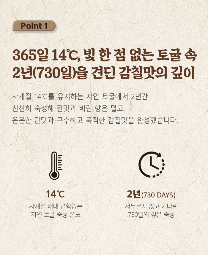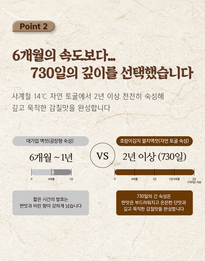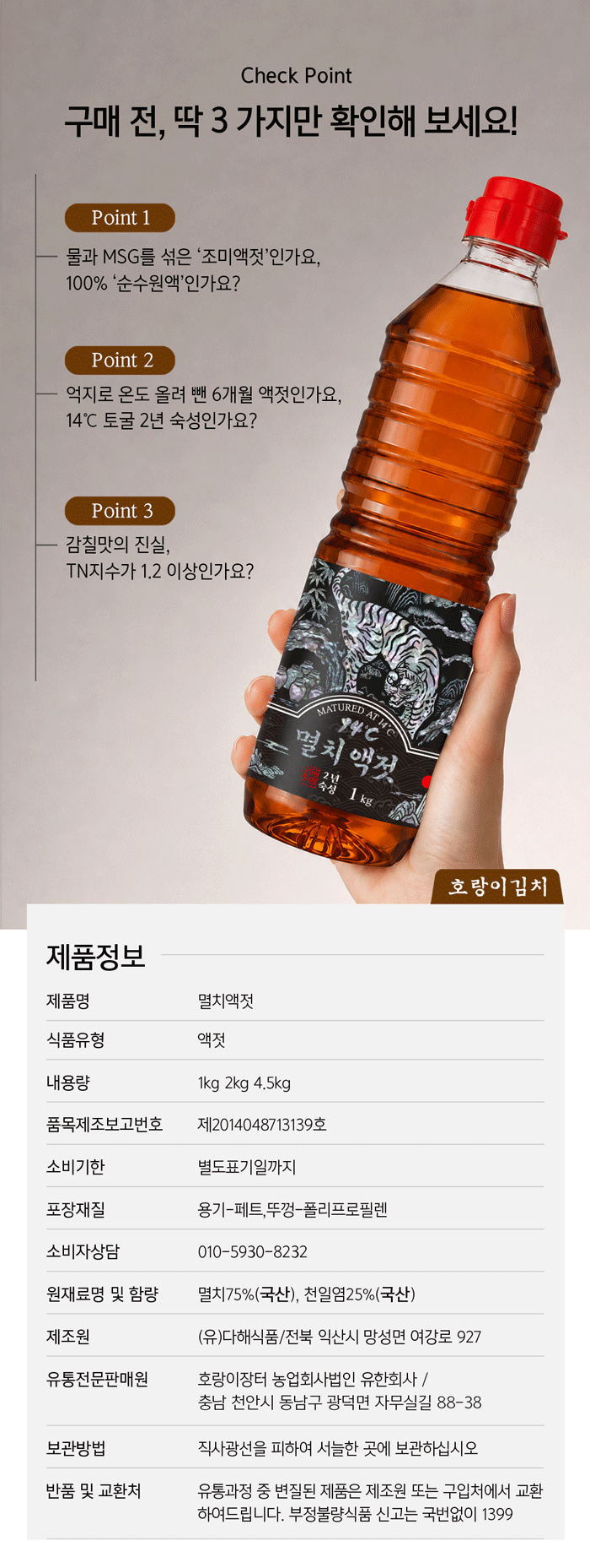
호랑이김치 멸치액젓 상세페이지는 ‘김치 전문가가 오랜 시간과 좋은 재료로 완성한 진짜 액젓’이라는 제품의 가치를 소비자가 직관적으로 이해할 수 있도록 구성했습니다. 첫 화면에서는 제품과 김치를 함께 배치해 멸치액젓의 용도를 명확하게 보여주고, 1kg, 2kg, 4.5kg의 다양한 제품 구성을 한눈에 전달했습니다. 이어지는 화면에서는 항아리에서 천천히 숙성되는 액젓의 모습을 중심으로 730일 자연 숙성이라는 가장 중요한 차별점을 강조했습니다. 14℃ 자연 토굴에서 2년 이상 숙성한다는 이야기를 전통적인 항아리와 깊은 브라운 컬러로 표현해 시간과 정성의 이미지를 시각화했습니다.
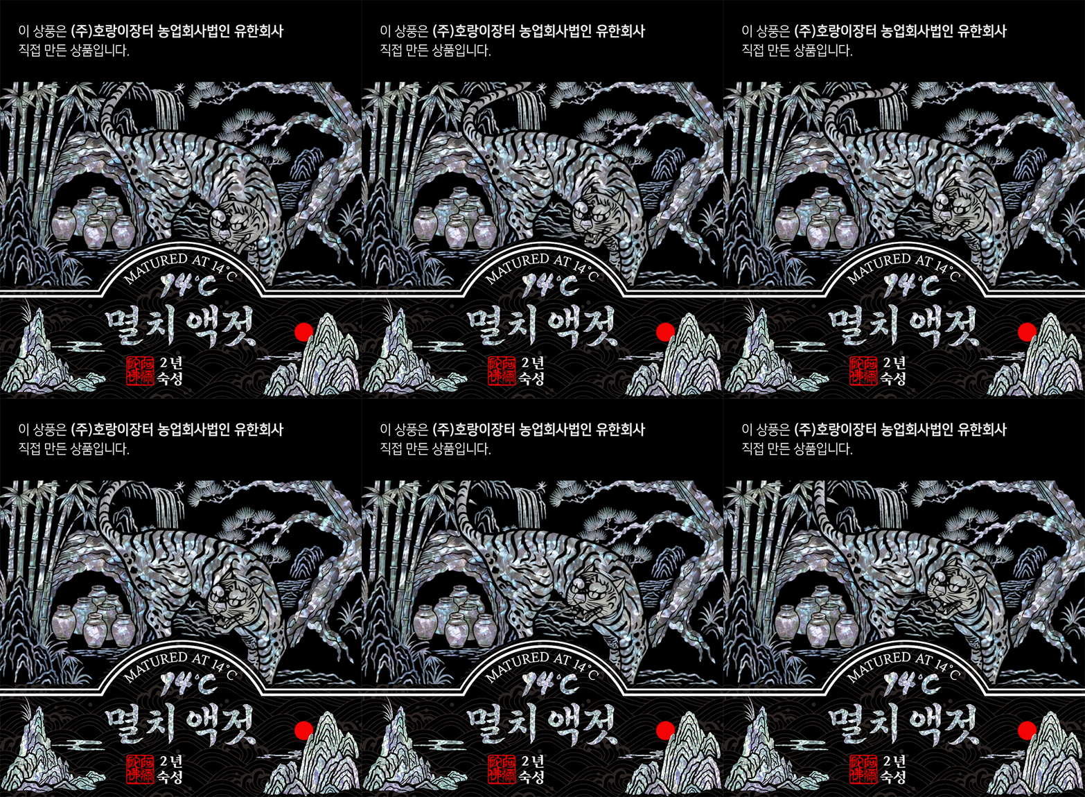
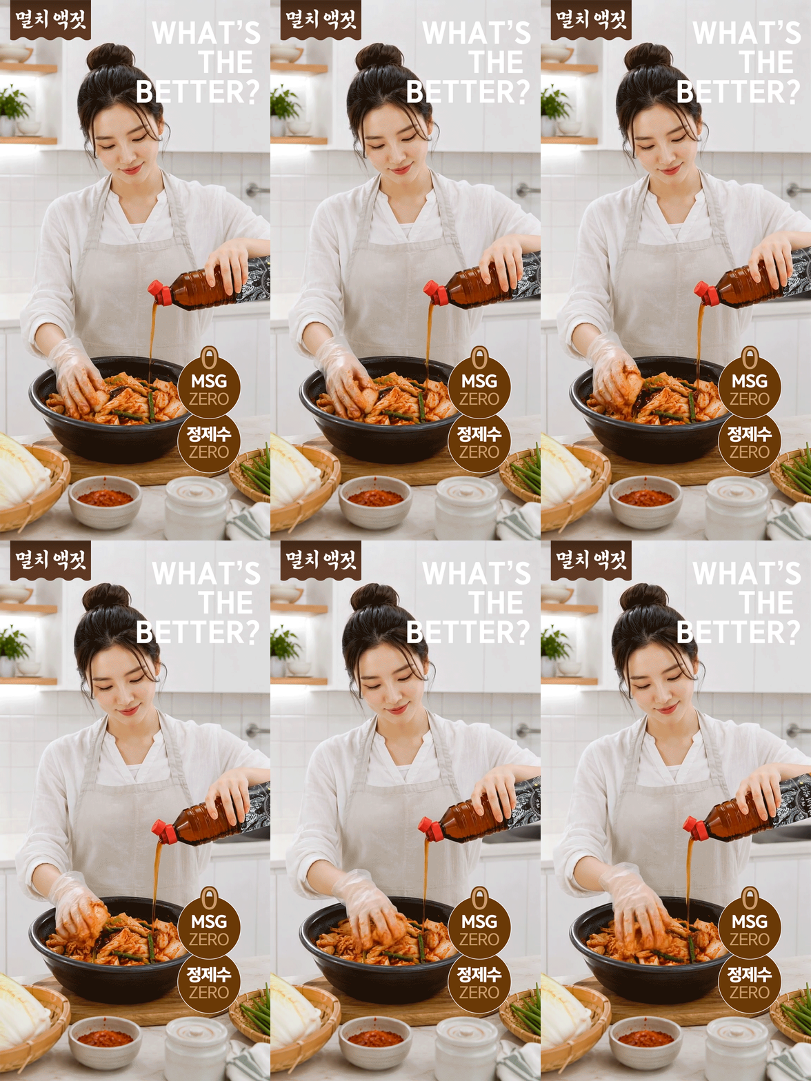
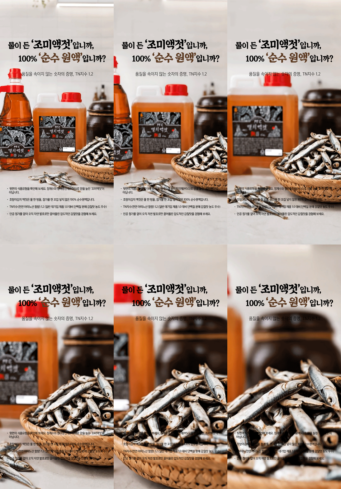
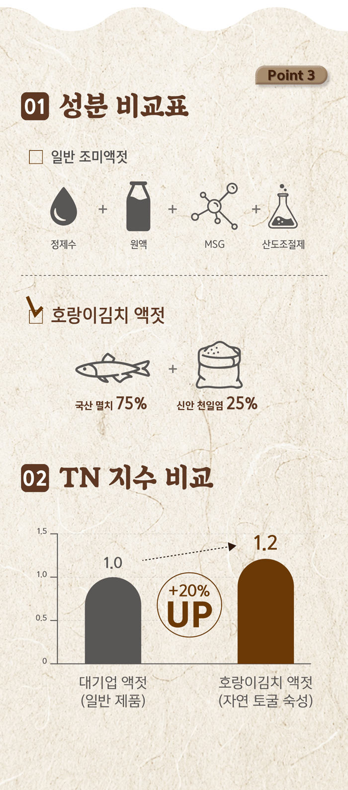
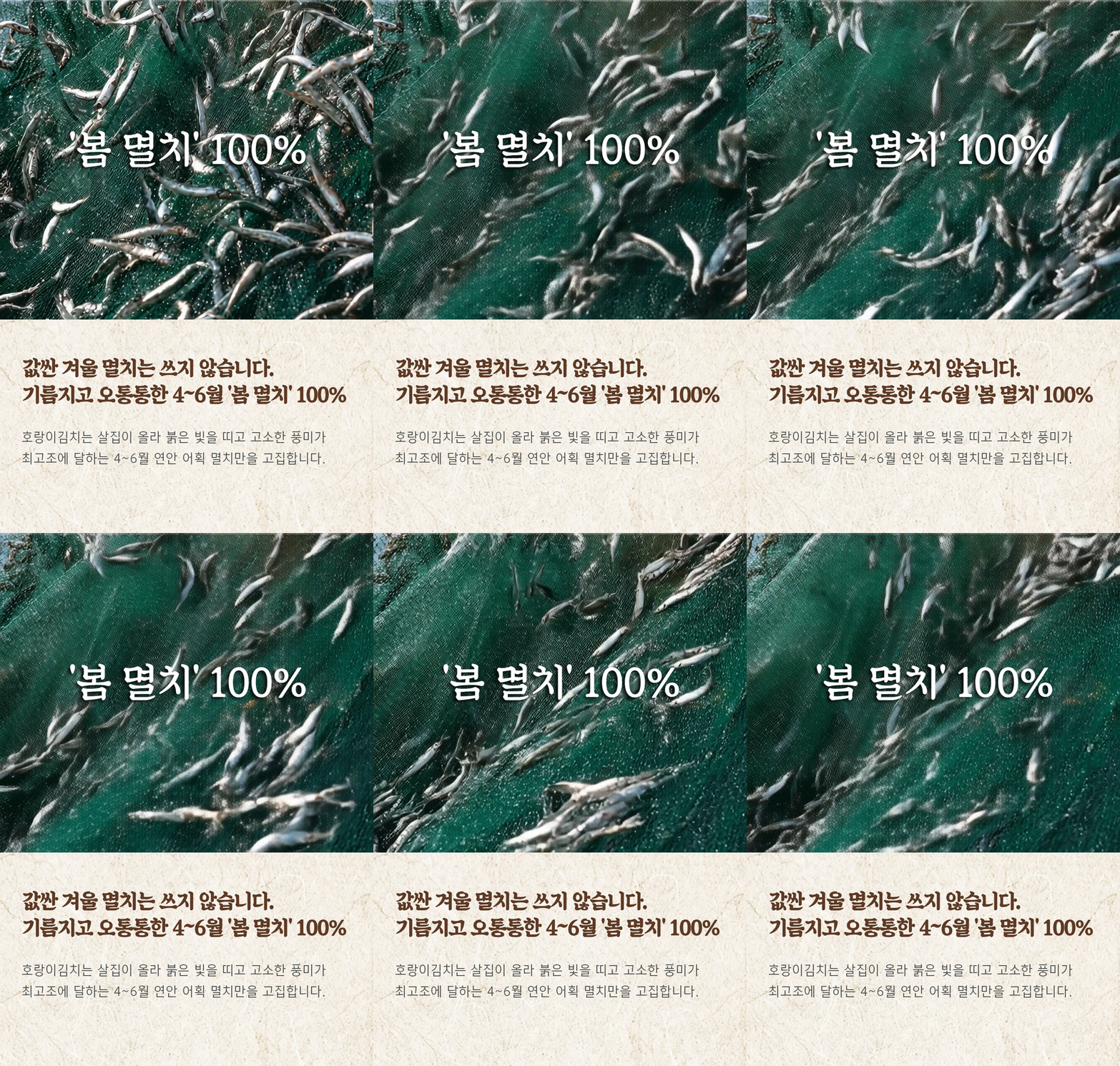
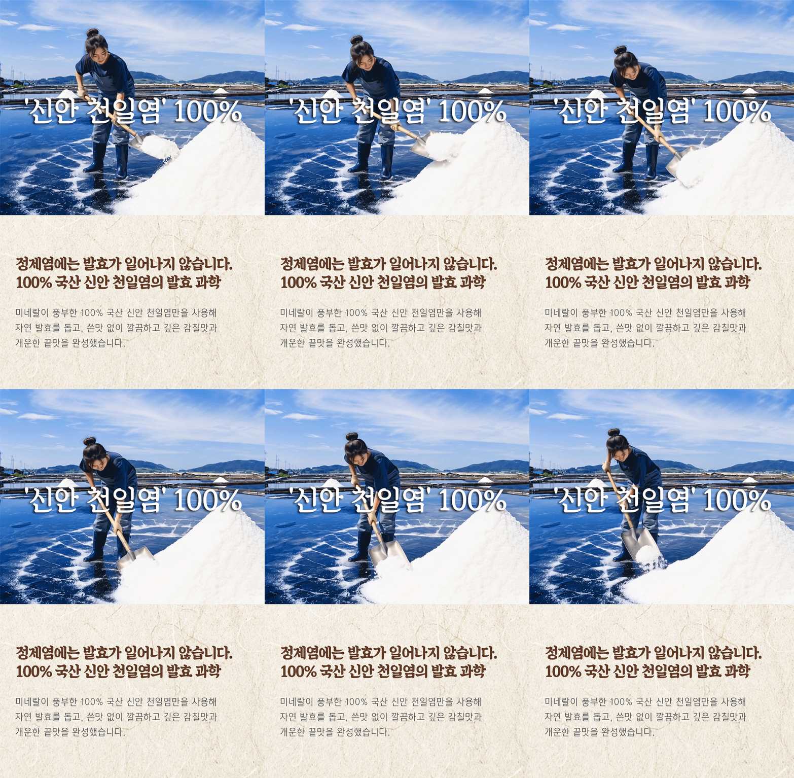
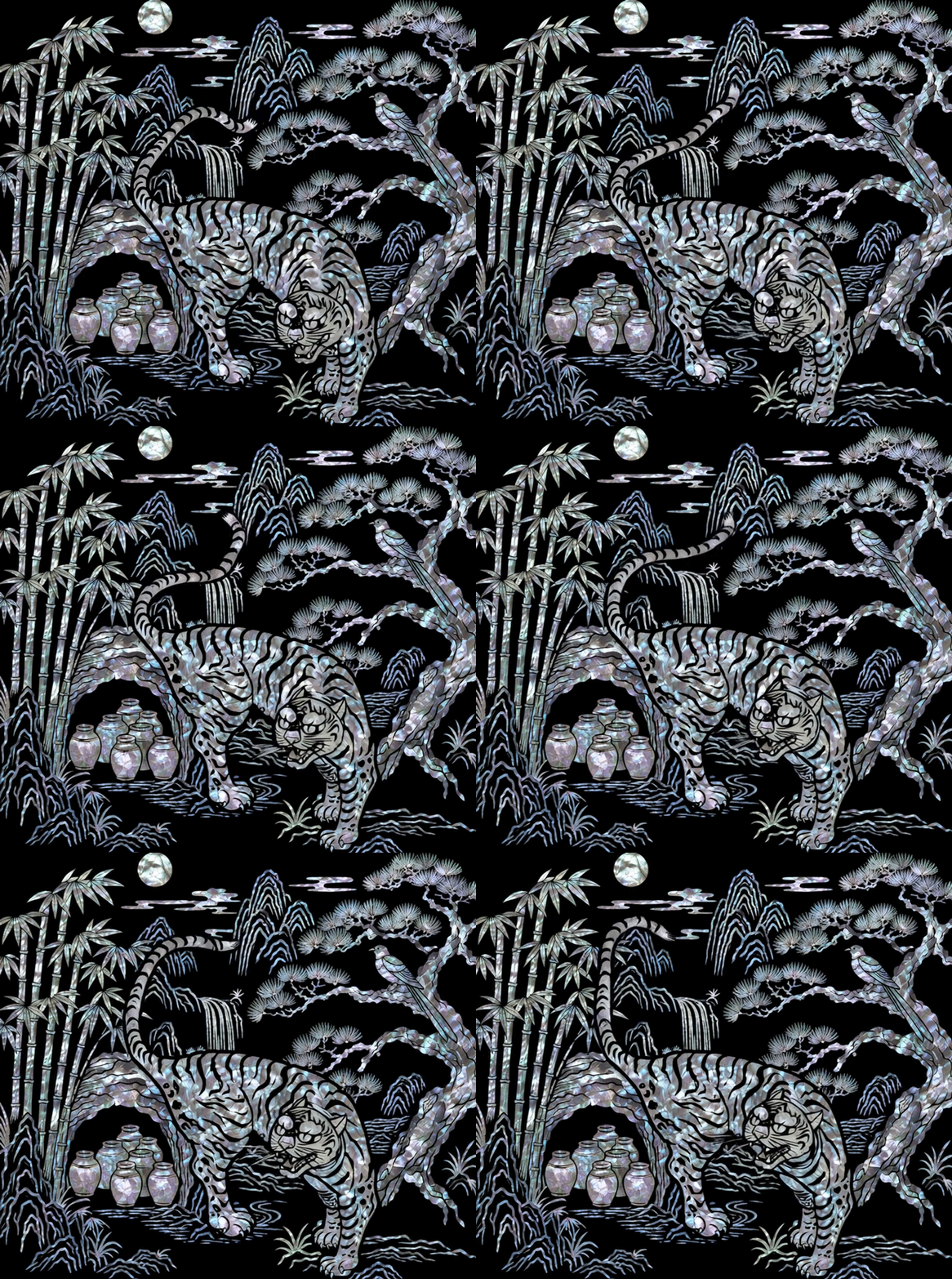
원재료에 대한 신뢰도 역시 상세페이지의 중요한 디자인 요소입니다. 살이 오르고 풍미가 좋은 **4~6월 봄 멸치 100%**와 **국산 신안 천일염 100%**를 실제 산지와 어획, 염전 이미지를 활용해 보여주며 원재료의 출처와 품질을 강조했습니다. MSG와 정제수를 넣지 않은 순수원액이라는 특징은 실제 김치를 버무리는 장면과 함께 간결한 아이콘으로 전달해 소비자가 제품의 장점을 빠르게 인지할 수 있도록 구성했습니다. 전체적인 디자인은 아이보리색 한지 질감과 짙은 브라운 컬러를 기본으로 사용해 전통 발효식품이 가진 깊이와 자연스러움을 표현했습니다. 특히 패키지에 적용된 호랑이, 산수, 대나무, 소나무, 항아리 등의 자개 모티프를 상세페이지 마지막까지 연결해 브랜드만의 한국적인 정체성을 강화했습니다. 단순히 제품 정보를 나열하기보다 봄 멸치의 어획부터 신안 천일염, 730일 숙성, 김치 조리까지 하나의 흐름으로 구성하여 호랑이김치 멸치액젓이 가진 시간, 원재료, 숙성 방식, 깊은 감칠맛을 하나의 브랜드 이야기로 전달하는 상세페이지입니다.
The Horangi Kimchi Anchovy Fish Sauce detail page was designed to communicate the value of “authentic fish sauce crafted by kimchi experts with quality ingredients and time.” The opening section presents the product alongside freshly prepared kimchi, immediately showing its purpose while introducing the 1kg, 2kg, and 4.5kg sizes. The following sections focus on the product’s key distinction: 730 days of natural aging. Traditional fermentation jars and deep brown tones visually express the patience and craftsmanship behind more than two years of aging in a naturally maintained 14°C cave environment.
Ingredient transparency is another central element of the design. Images of fishing and traditional salt fields highlight the use of 100% spring anchovies caught from April to June and 100% Korean Shinan sea salt, reinforcing the quality and origin of the ingredients. The absence of MSG and purified water is communicated through simple graphic elements and realistic cooking scenes, making the product’s purity easy to understand at a glance.
The overall visual identity combines warm ivory Korean paper textures with rich brown tones to convey the depth and authenticity of traditional fermentation. Mother-of-pearl-inspired motifs—including the tiger, mountains, bamboo, pine trees, and traditional jars—connect the package design with the detail page and create a distinctive Korean premium identity. Rather than simply listing product information, the page builds a visual story from fresh anchovies and sea salt to 730 days of aging and the final preparation of kimchi, communicating the product’s core values of time, quality ingredients, traditional fermentation, and deep umami flavor.
"Any unauthorized reproduction, distribution and exhibition of this work will be subject to applicable law. © 2026 NODE
@park_keun