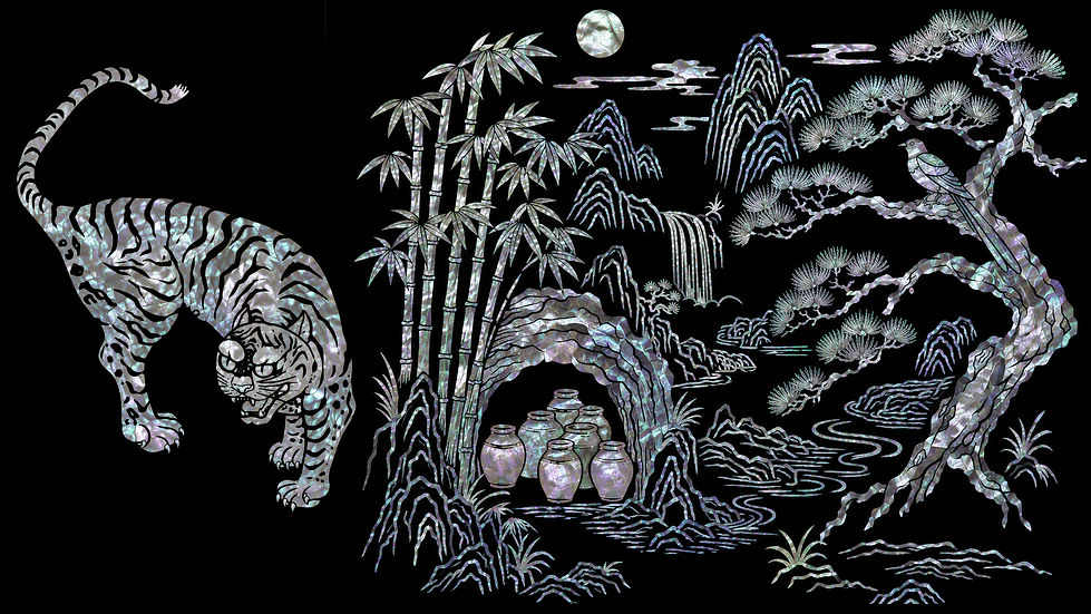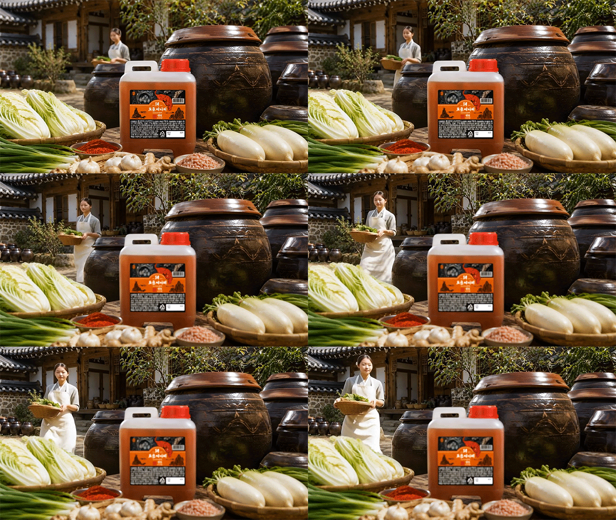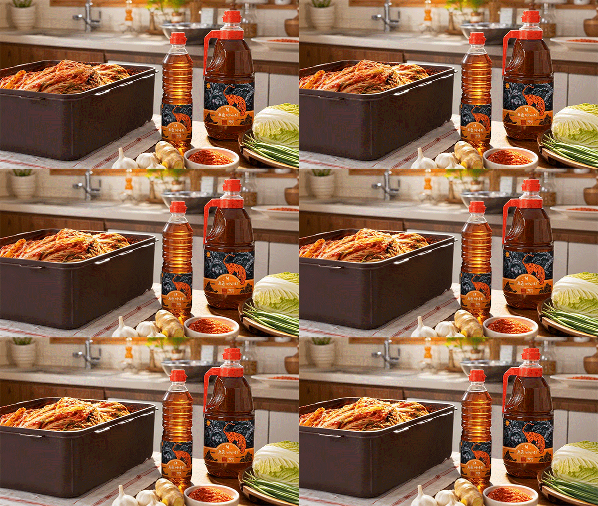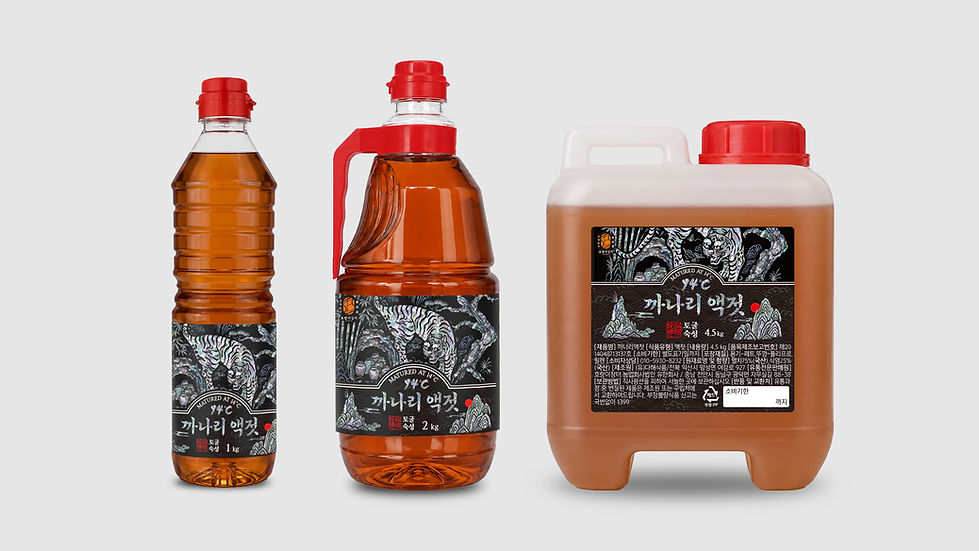
토굴 까나리 액젓 패키지는 한국의 전통 발효문화와 현대적인 브랜드 감성을 조화롭게 담아낸 프리미엄 디자인입니다. '토굴에서 14도 숙성'이라는 브랜드의 핵심 가치를 시각적으로 전달하기 위해 호랑이, 토굴, 장독, 소나무, 대나무, 산수 풍경을 하나의 일러스트로 구성했습니다. 메인 컬러인 오렌지는 오랜 숙성을 거친 깊은 감칠맛과 풍부한 풍미를 상징하며 검은 배경은 토굴의 깊이와 전통적인 장인의 철학을 나타냅니다. 중앙의 호랑이는 한국적인 상징성과 강인함을 나타내며 토굴 속 장독은 오랜 시간 자연 발효된 숙성 과정을 의미하죠. 대나무와 소나무, 산과 구름은 한국 전통 산수화의 요소를 현대적으로 재해석하여 브랜드의 정체성을 강화합니다.
The Togul Kanari Fish Sauce package is a premium design that harmoniously blends Korean traditional fermentation culture with a contemporary brand identity. Inspired by the concept of "14 Years of Aging in a Traditional Cave Cellar," the package visually expresses the brand story through illustrations of a tiger, cave, earthenware jars, pine trees, bamboo, and traditional Korean landscapes.
The signature orange color represents the rich umami flavor developed through long-term aging, while the black background symbolizes the depth of the traditional cave cellar and the philosophy of authentic craftsmanship. The tiger serves as a powerful symbol of Korean heritage and strength, while the earthenware jars inside the cave represent the natural fermentation process that develops over many years. Bamboo, pine trees, mountains, and flowing clouds reinterpret classic Korean landscape paintings in a modern way, reinforcing the brand's cultural identity.
"Any unauthorized reproduction, distribution and exhibition of this work will be subject to applicable law. © 2026 NODE
@park_keun