


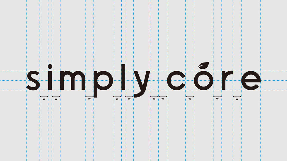
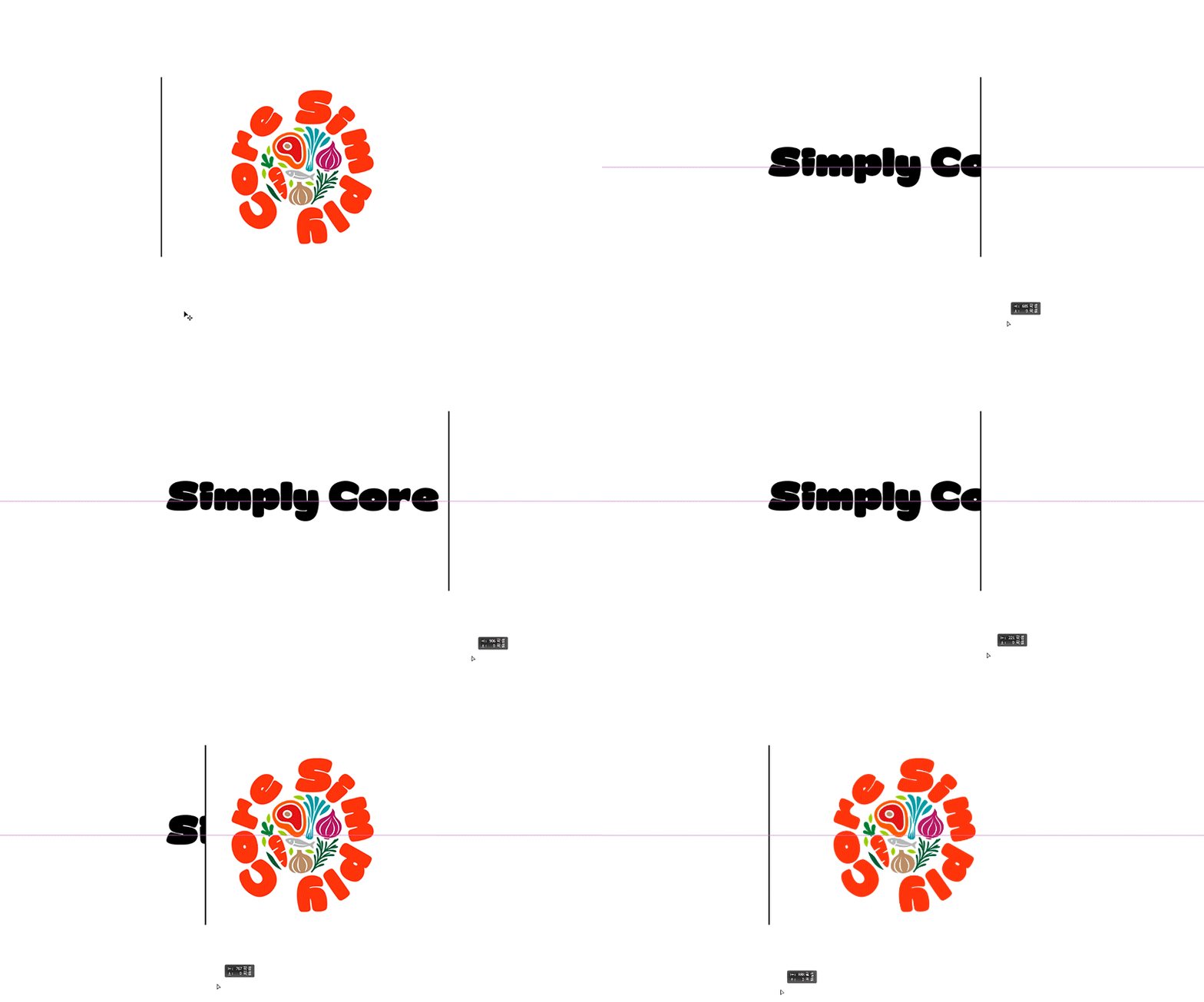
(주)선제의 SIMPLY CORE B.I 로고 개발은 브랜드가 추구하는 ‘복잡함은 덜고, 본질은 더하는 것’이라는 철학을 시각적으로 정리하는 과정에서 시작되었습니다. 초기 스케치에서는 다양한 굵기와 비례, 대소문자 조합, 세리프와 산세리프, 유기적인 곡선과 기하학적 구조 등 폭넓은 워드마크 방향을 연구하고 브랜드에 가장 적합한 인상을 다양하게 찾았습니다. 시안 개발 과정에서는 단순히 간결한 로고를 만드는 데 그치지 않고 좋은 원료와 자연스러운 맛, 요리의 균형, 그리고 누구나 쉽게 활용할 수 있는 친근함 등 다양한 브랜드 이미지를 아이덴티티 안에 담는 데 집중했습니다. 워드마크만으로 표현하기 어려운 브랜드의 상징성과 확장성을 보완하기 위해 별도의 심볼, 엠블럼 시스템을 함께 개발했습니다. 식재료와 자연의 형태를 하나의 원형 구조 안에 조화롭게 결합한 심볼은 다양한 재료가 균형을 이루어 하나의 맛을 완성하는 요리의 본질을 표현하며, 패키지와 라벨, 아이콘, 온라인 콘텐츠 등 작은 영역에서도 브랜드를 명확하게 인지할 수 있도록 합니다. 컬러 시스템은 식욕과 따뜻한 에너지를 전달하는 오렌지, 신선한 원료와 자연을 상징하는 그린, 간결함과 현대적인 전문성을 더하는 블랙을 중심으로 구성했습니다. 이러한 디자인 요소들은 BALANCE, INGREDIENT, NATURE, CORE라는 네 가지 브랜드 에센스를 유기적으로 연결하며, 좋은 원료와 맛의 균형을 바탕으로 복잡한 요리를 보다 쉽고 스마트하게 완성한다는 SIMPLY CORE의 브랜드 철학을 일관된 시각 언어로 구축합니다.
The development of Sunje Food’s SIMPLY CORE B.I. logo began with the process of visually defining the brand philosophy: “Less complexity, more essence.” During the initial sketching stage, we explored a wide range of wordmark directions, experimenting with different weights and proportions, uppercase and lowercase combinations, serif and sans-serif typefaces, organic curves, and geometric structures to discover the visual expression that best represents the brand. Throughout the concept development process, the goal was not simply to create a minimal logo, but to incorporate a variety of brand attributes into a cohesive identity, including quality ingredients, natural flavors, balanced cooking, and an approachable character that anyone can easily understand and use. To strengthen the brand’s symbolism and expand its visual applications beyond the wordmark, separate symbol and emblem systems were also developed. The symbol, which harmoniously combines the forms of ingredients and elements of nature within a circular structure, represents the essence of cooking—different ingredients coming together in balance to create a complete flavor. It also ensures strong brand recognition across various applications, including packaging, labels, icons, and digital content, even at smaller scales. The color system is centered around orange, representing appetite and warm energy; green, symbolizing fresh ingredients and nature; and black, conveying simplicity and modern professionalism. Together, these design elements organically connect the four key brand essences—BALANCE, INGREDIENT, NATURE, and CORE—and establish a consistent visual language that communicates SIMPLY CORE’s philosophy of making complex cooking easier and smarter through quality ingredients and balanced flavor.
"Any unauthorized reproduction, distribution and exhibition of this work will be subject to applicable law. © 2026 NODE
@park_keun




TYPE_01


TYPE_02


TYPE_03


TYPE_04


TYPE_06


브랜드 아이덴티티 시스템


%EC%84%A0%EC%A0%9C_simplycore_BI_v02_%EB%82%A9%ED%92%88%ED%8C%8C%EC%9D%BC_%ED%8E%98%EC%9D%B4%EC%A7%80_01.jpg)
%EC%84%A0%EC%A0%9C_simplycore_BI_v02_%EB%82%A9%ED%92%88%ED%8C%8C%EC%9D%BC_%ED%8E%98%EC%9D%B4%EC%A7%80_02.jpg)
%EC%84%A0%EC%A0%9C_simplycore_BI_v02_%EB%82%A9%ED%92%88%ED%8C%8C%EC%9D%BC_%ED%8E%98%EC%9D%B4%EC%A7%80_03.jpg)
%EC%84%A0%EC%A0%9C_simplycore_BI_v02_%EB%82%A9%ED%92%88%ED%8C%8C%EC%9D%BC_%ED%8E%98%EC%9D%B4%EC%A7%80_04.jpg)
%EC%84%A0%EC%A0%9C_simplycore_BI_v02_%EB%82%A9%ED%92%88%ED%8C%8C%EC%9D%BC_%ED%8E%98%EC%9D%B4%EC%A7%80_05.jpg)
%EC%84%A0%EC%A0%9C_simplycore_BI_v02_%EB%82%A9%ED%92%88%ED%8C%8C%EC%9D%BC_%ED%8E%98%EC%9D%B4%EC%A7%80_06.jpg)
%EC%84%A0%EC%A0%9C_simplycore_BI_v02_%EB%82%A9%ED%92%88%ED%8C%8C%EC%9D%BC_%ED%8E%98%EC%9D%B4%EC%A7%80_07.jpg)
%EC%84%A0%EC%A0%9C_simplycore_BI_v02_%EB%82%A9%ED%92%88%ED%8C%8C%EC%9D%BC_%ED%8E%98%EC%9D%B4%EC%A7%80_08.jpg)
%EC%84%A0%EC%A0%9C_simplycore_BI_v02_%EB%82%A9%ED%92%88%ED%8C%8C%EC%9D%BC_%ED%8E%98%EC%9D%B4%EC%A7%80_08_1.jpg)
%EC%84%A0%EC%A0%9C_simplycore_BI_v02_%EB%82%A9%ED%92%88%ED%8C%8C%EC%9D%BC_%ED%8E%98%EC%9D%B4%EC%A7%80_09.jpg)
%EC%84%A0%EC%A0%9C_simplycore_BI_v02_%EB%82%A9%ED%92%88%ED%8C%8C%EC%9D%BC_%ED%8E%98%EC%9D%B4%EC%A7%80_10.jpg)
%EC%84%A0%EC%A0%9C_simplycore_BI_v02_%EB%82%A9%ED%92%88%ED%8C%8C%EC%9D%BC_%ED%8E%98%EC%9D%B4%EC%A7%80_11.jpg)
%EC%84%A0%EC%A0%9C_simplycore_BI_v02_%EB%82%A9%ED%92%88%ED%8C%8C%EC%9D%BC_%ED%8E%98%EC%9D%B4%EC%A7%80_12.jpg)
%EC%84%A0%EC%A0%9C_simplycore_BI_v02_%EB%82%A9%ED%92%88%ED%8C%8C%EC%9D%BC_%ED%8E%98%EC%9D%B4%EC%A7%80_13.jpg)
%EC%84%A0%EC%A0%9C_simplycore_BI_v02_%EB%82%A9%ED%92%88%ED%8C%8C%EC%9D%BC_%ED%8E%98%EC%9D%B4%EC%A7%80_16.jpg)
%EC%84%A0%EC%A0%9C_simplycore_BI_v02_%EB%82%A9%ED%92%88%ED%8C%8C%EC%9D%BC_%ED%8E%98%EC%9D%B4%EC%A7%80_15.jpg)
%EC%84%A0%EC%A0%9C_simplycore_BI_v02_%EB%82%A9%ED%92%88%ED%8C%8C%EC%9D%BC_%ED%8E%98%EC%9D%B4%EC%A7%80_17.jpg)
%EC%84%A0%EC%A0%9C_simplycore_BI_v02_%EB%82%A9%ED%92%88%ED%8C%8C%EC%9D%BC_%ED%8E%98%EC%9D%B4%EC%A7%80_18.jpg)
%EC%84%A0%EC%A0%9C_simplycore_BI_v02_%EB%82%A9%ED%92%88%ED%8C%8C%EC%9D%BC_%ED%8E%98%EC%9D%B4%EC%A7%80_19.jpg)