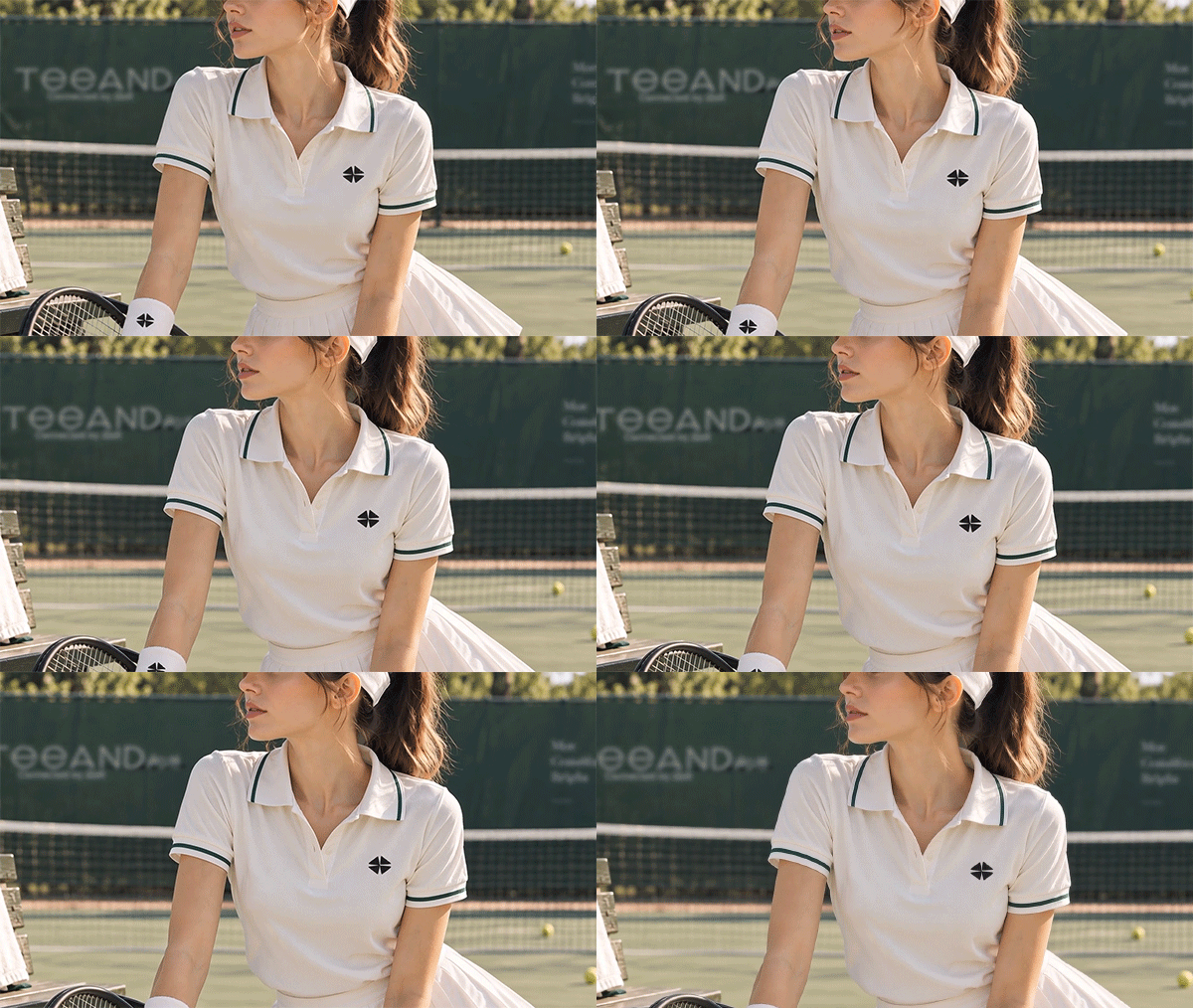
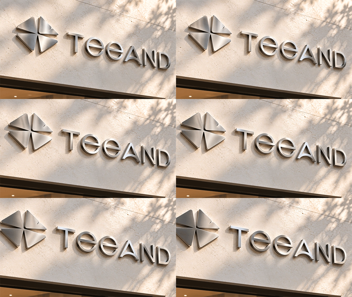
TEE AND의 브랜드 아이덴티티는 골프를 단순한 스포츠가 아닌 사람과 사람, 플레이와 일상, 스타일과 라이프를 연결하는 하나의 경험으로 바라보는 데서 시작합니다. 워드마크는 불필요한 장식을 덜어낸 기하학적 구조와 여유로운 자간을 통해 현대적이고 세련된 스포츠 브랜드의 이미지를 표현했으며, 심볼은 세잎클로버와 나비가 만나는 순간 네잎클로버가 완성되는 이야기를 시각화했습니다. 나비는 새로운 장소와 사람을 이어주는 ‘연결’을, 클로버는 만남 속에서 발견하는 ‘행운과 즐거움’을 상징합니다. 네 방향으로 펼쳐지는 간결한 심볼 구조는 작은 크기에서도 높은 인지성을 확보해 골프웨어, 스포츠웨어, 손목밴드, 골프화, 패키지, 매장 사인 등 다양한 환경에 유연하게 적용됩니다. 기존 글로벌 스포츠 브랜드의 단순하고 강한 심볼 체계처럼 워드마크 없이도 독립적으로 사용할 수 있도록 설계했으며 의류와 제품에서는 하나의 그래픽 포인트로 기능합니다. 이를 통해 TEE AND가 추구하는 ‘AND = Connection’이라는 철학과 골프에서 시작해 일상으로 확장되는 라이프스타일 브랜드의 방향성을 하나의 일관된 디자인 시스템으로 완성했습니다.
TEE AND’s brand identity begins with the idea of viewing golf not simply as a sport, but as an experience that connects people, play and everyday life, style and lifestyle. The wordmark features a clean geometric structure and generous letter spacing, creating a modern and sophisticated sports brand image. The symbol visualizes the moment when a butterfly meets a three-leaf clover to complete the form of a four-leaf clover. The butterfly represents “connection,” linking new places and people, while the clover symbolizes “luck and joy” discovered through meaningful encounters. Its simple four-directional structure ensures strong recognition even at small sizes, allowing the symbol to be applied flexibly across golfwear, sportswear, wristbands, golf shoes, packaging, and store signage. Like the simple yet powerful symbol systems of leading global sports brands, it is designed to function independently without the wordmark and serve as a distinctive graphic element across products and apparel. Through this consistent visual system, TEE AND expresses its core philosophy of “AND = Connection” and establishes its direction as a lifestyle brand that begins with golf and naturally extends into everyday life.
"Any unauthorized reproduction, distribution and exhibition of this work will be subject to applicable law. © 2026 NODE
@park_keun








Design Concepts Collection