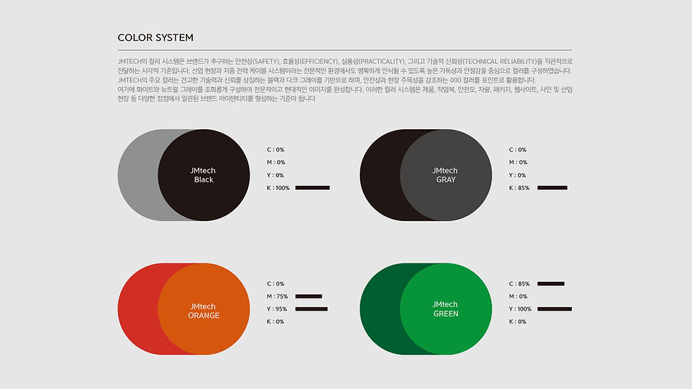
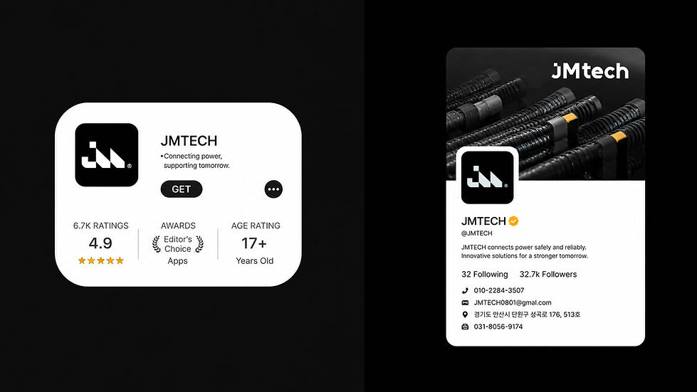
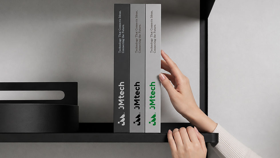
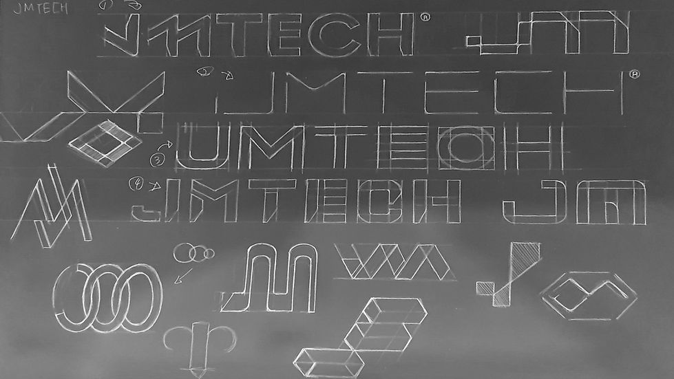
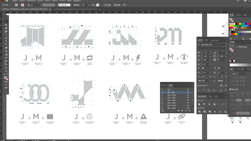
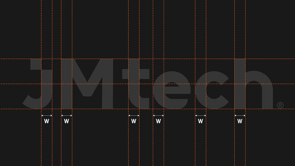
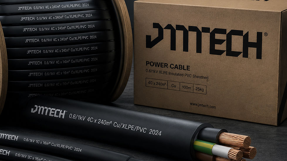
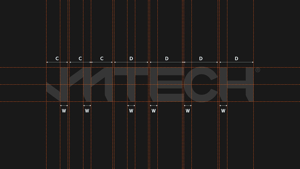
첨부한 JMTECH 리브랜딩 디자인은 지중 전력 케이블과 보호관을 보다 안전하고 효율적으로 시공하기 위한 기업의 기술적 정체성을 현대적인 시각 언어로 재구성했습니다. 로고는 알파벳 J와 M을 중심으로 연결, 전력의 흐름, 케이블 구조, 모듈 시스템에서 착안한 기하학적 형태를 결합해 견고하면서도 직관적인 이미지를 완성했습니다. 블랙과 그레이는 산업 현장에서 요구되는 전문성과 신뢰성을 표현하며, 그린은 기술의 발전과 효율성, 미래지향적인 이미지를 강조합니다. 일관된 그리드와 모듈 구조를 기반으로 개발된 아이덴티티는 웹사이트, 사원증, 작업복, 안전모, 산업 장비 등 다양한 환경에서도 명확한 브랜드 인상을 유지합니다. JMTECH는 이러한 디자인 시스템을 통해 ‘안전하고 실용적인 설계’와 ‘현장을 생각한 기술과 효율’을 시각화하고, 신뢰할 수 있는 전력 인프라 파트너라는 브랜드 가치를 전달합니다.
JMTECH’s rebranding transforms its expertise in underground power cable and protective conduit installation into a modern and systematic visual identity. The logo combines the letters J and M with geometric forms inspired by connection, power flow, cable structures, and modular systems, creating a strong yet intuitive brand image. Black and gray communicate professionalism, durability, and technical reliability, while green represents efficiency, technological progress, and a forward-looking vision. Built on a consistent grid and modular structure, the identity maintains a clear and recognizable presence across websites, employee IDs, workwear, safety equipment, and industrial applications. Through this integrated design system, JMTECH visually expresses its core values of “Safety & Practical Design” and “Technology & Efficiency,” positioning the brand as a reliable partner for the future of power infrastructure.
"Any unauthorized reproduction, distribution and exhibition of this work will be subject to applicable law. © 2026 NODE
@park_keun


TYPE_01


TYPE_02


TYPE_03


TYPE_04


TYPE_05


TYPE_06


TYPE_07


TYPE_08


TYPE_선택(임시) >>>>>>>>>>>>>>>>>>>>>>>>>>>>>>>>>>>>>>>>>>